In quality management, upper and lower control limits play a critical role in monitoring and maintaining process stability. These limits provide valuable insight into the variation of data and help organizations determine when a process is in or out of control. In this article, we will explore the concept of upper and lower control limits, what they mean, and how they are used to ensure consistent quality.
Defining upper and lower control limits
Upper and lower control limits represent the boundaries within which a process is considered stable and under control. They are typically derived from statistical analysis of process data, specifically using control charts. These limits serve as reference points to distinguish between normal variation and special causes of variation in a process.
Meaning of upper and lower control limits
- Process stability: Upper and lower control limits provide a visual representation of the expected range of variation in a process. When data points fall within these limits, it indicates that the process is stable and performing as expected. This stability is essential for consistent quality output and allows organizations to identify when a process is operating within acceptable parameters.
- Identify special causes: Outliers are factors that can significantly affect the process and result in non-random patterns in the data. By establishing control limits, organizations can identify data points that fall outside of these limits, indicating the presence of special causes. This prompts further investigation to identify and address the underlying issues affecting process performance.
- Continuous improvement: Control limits serve as a tool for continuous improvement by enabling organizations to identify trends or patterns in data that may indicate opportunities for optimization. Monitoring data over time helps identify areas for improvement, allowing organizations to make data-driven decisions and implement corrective actions to improve process efficiency and quality.
Leverage upper and lower control limits
To effectively use upper and lower control limits, organizations follow these key steps:
- Data collection: Collect relevant data points from the process under consideration. The data can be measurements, observations, or other performance indicators.
- Control chart construction: Plot the collected data on a control chart, which typically consists of a central line representing the process mean and upper and lower control limits derived from statistical calculations. Common control charts include the X-bar chart for measuring central tendency and the R chart for measuring the range of variation.
- Interpreting the control chart: Analyze the plotted data points in relation to the control limits. Data points within the control limits indicate a stable process, while data points outside the control limits indicate potential problems that require investigation.
- Action and improvement: When data points indicate the presence of specific causes, organizations should take action to identify and address the underlying factors causing the variation. This may include process adjustments, training, equipment maintenance, or other corrective actions aimed at restoring process stability and improving overall quality.
Standard Deviation and Control Limits
Control limits are typically derived based on the standard deviation of the process data. The standard deviation measures the dispersion or scatter of the data points around the process mean. A common practice is to set control limits at a certain number of standard deviations from the mean. The most common approach is to set the control limits at ±3 standard deviations, which covers approximately 99.7% of the data points in a normally distributed process.
Multiple Control Charts
In quality management, different types of control charts can be used depending on the nature of the data and the characteristics of the process. X-bar and R charts are commonly used for continuous data, while p and c charts are used for attribute data. Each type of control chart has its own set of control limits based on the specific calculations and statistical methods used.
Process Capability Analysis
Control limits provide information about process stability, but they do not necessarily indicate whether the process is capable of meeting specifications or customer requirements. To assess process capability, organizations often perform process capability analysis, which compares process variation (as measured by control limits) to specification limits. This analysis helps determine whether the process is capable of producing within the desired range.
Continuous Monitoring and Adjustment
Implementing control limits is not a one-time activity. To ensure continued process stability and quality, organizations must continually monitor the process and update control limits as necessary. This is especially important when process improvements are implemented or when significant changes occur in the process or operating conditions. Regularly reviewing and updating control limits helps maintain accurate monitoring and timely identification of process problems.
Integration with Statistical Process Control (SPC)
Control limits are a fundamental aspect of statistical process control (SPC), a methodology used to monitor, control and improve processes. SPC involves the use of control charts, control limits, and statistical techniques to analyze process data and make informed decisions. By incorporating control limits into SPC practices, organizations can establish a systematic approach to quality management and drive continuous improvement efforts.
Conclusion
Upper and lower control limits are invaluable quality management tools that provide a visual representation of process stability and help identify specific causes of variation. By monitoring data using control charts and interpreting the results in relation to these limits, organizations can identify areas for improvement, implement corrective actions and continuously improve process efficiency and quality. By embracing the concept of upper and lower control limits, organizations can achieve consistent and exceptional standards of quality in their products or services, ultimately increasing customer satisfaction and organizational success.
FAQ
What is upper and lower control limits?
In a typical individual/moving range statistical process control chart, the upper and lower control limits (UCL and LCL) are three standard deviations from the historical mean of the set of readings. If the measurement remains within the upper and lower control limits, then the process is in control.
How do you define upper and lower control limits?
Find the average and standard deviation of the sample. Add three times the standard deviation to the average to get the upper control limit. Subtract three times the standard deviation from the average to get the lower control limit.
What is a upper control limit?
The upper control limit is used to mark the point beyond which a sample value is considered a special cause of variation. It is also used to define the upper limit of the common cause variation.
What is UCL & LCL?
UCL = Upper Control Limit. LCL = Lower Control Limit. Control Limits are calculated based on the amount of variation in the process you are measuring. One measure of variation is standard deviation*. A common method of calculating control limits is the mean +/- three standard deviations.
What is a lower control limit?
Overview: What is a lower control limit (LCL)?
On a control chart, the lower control limit is a line below the centerline that indicates the number below which any individual data point would be considered out of statistical control due to special cause variation.
How do you calculate UCL and LCL?
If you’re wondering how to calculate the control limits of your process dataset, here are the UCL and LCL formulas below:
- The upper control limit formula: UCL = x – (-L * σ)
- The lower control limit formula: LCL = x – (L * σ)
How do you calculate UCL and LCL in Excel?
Quote from video: See a lower control limit the formula for LCM is LC. You know is mean minus three standard deviation equals to our mean is here minus three x standard sample standard deviation of these values.
What is UCL and LCL in garment industry?
UCL represents upper control limit on a control chart, and LCL represents lower control limit. A control chart is a line graph that displays a continuous picture of what is happening in production process with respect to time.
What are the 3 sigma control limits?
Three-sigma limits (3-sigma limits) is a statistical calculation that refers to data within three standard deviations from a mean. Three-sigma limits are used to set the upper and lower control limits in statistical quality control charts.
What is the difference between UCL and USL?
The UCL or upper control limit and LCL or lower control limit are limits set by your process based on the actual amount of variation of your process. The USL or upper specification limit and LSL or lower specification limit are limits set by your customers requirements.
How do you define USL and LSL?
LSL stands for Lower Specification Limit and USL stands for Upper Specification Limit. Often we describe Cpk as the capability the process is achieving whether or not the mean is centered between the specification limits.
What is USL and LSL in control chart?
These are USL (Upper Specification Limit) and LSL (Lower Specification Limit). Such limits externally imposed (e.g. imposed by the customer). Units falling outside these limits are unac- ceptable and will be rejected.
What is UCL upper control limit?
Upper Control Limit (UCL) means a value greater than the maximum value of a chemical or physical parameter that can be attributed to natural fluctuations and sampling and agree upon by the Administrator and the operator prior to initiation of mining.
What is the UCL formula?
UCL (R) = R-bar x D4 Plot the Upper Control Limit on the R chart. 6. If the subgroup size is between 7 and 10, select the appropriate constant, called D3, and multiply by R-bar to determine the Lower Control Limit for the Range Chart.
How is USL and LSL calculated?
1 The Six Sigma Process: USL = Mean + 3, LSL = Mean -3
What is a control chart in Six Sigma?
SPC – Calculating Upper/Lower Control Limits
How are control limits defined for control charts?
September 2022) Control limits, also known as natural process limits, are horizontal lines drawn on a statistical process control chart, usually at a distance of ±3 standard deviations of the plotted statistic’s mean, used to judge the stability of a process.
How do you find the upper class limit?
To find the upper limit of the first class, subtract one from the lower limit of the second class. Then continue to add the class width to this upper limit to find the rest of the upper limits. Find the boundaries by subtracting 0.5 units from the lower limits and adding 0.5 units from the upper limits.
What is upper class and lower class limit example?
In a frequency distribution table, the difference between the upper-class limit and the lower class limit is called the width or size of the class interval. For example, each of the groups 20-25, 25-30, 30-35, etc., is called a class interval.
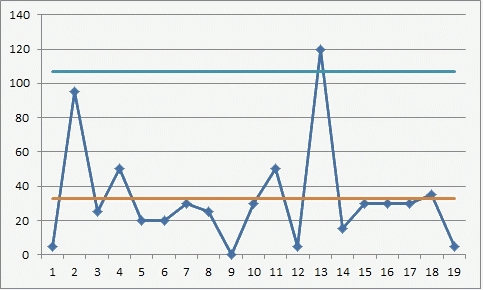
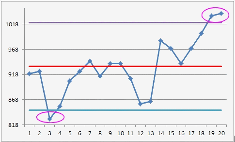
Control chart limits
There is a right way to calculate the limits of control charts.
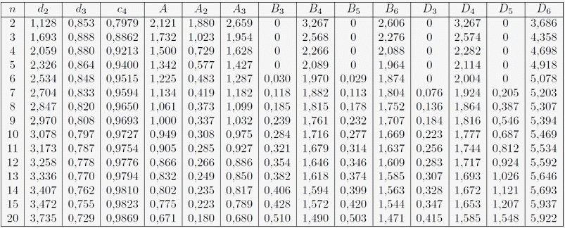
See the table of Burr constants at the bottom of the page.
The most common method of determining the boundaries for Xmr maps is to use the average moving ranges, which is commonly referred to by the symbol: Rbar
Map boundaries are determined by multiplying the average moving range (32.63) by the constant A3 = 2.66 (=3/(d2/√n) with n = 1, then adding and subtracting this product from the average.
Xbar-2,66Rbar and Xbar+2,66Rbar with 2,66Rbar=32,63×2,66=86,8 i.e. Low Limit = 847,2 and High Limit = 1020,8
The upper limit for the range graph is obtained by multiplying the mean moving range by the constant 3.267 (D4). For these data, this limit is 106.6 = 3.267 x 32.63.